
Tesla has basically made having a gigantic touchscreen in an electric car mandatory. Polestar has certainly followed that lead, and Rivian intends to go that way as well. Over in Europe, the adorable Honda E has screens covering the entire width of the dash.
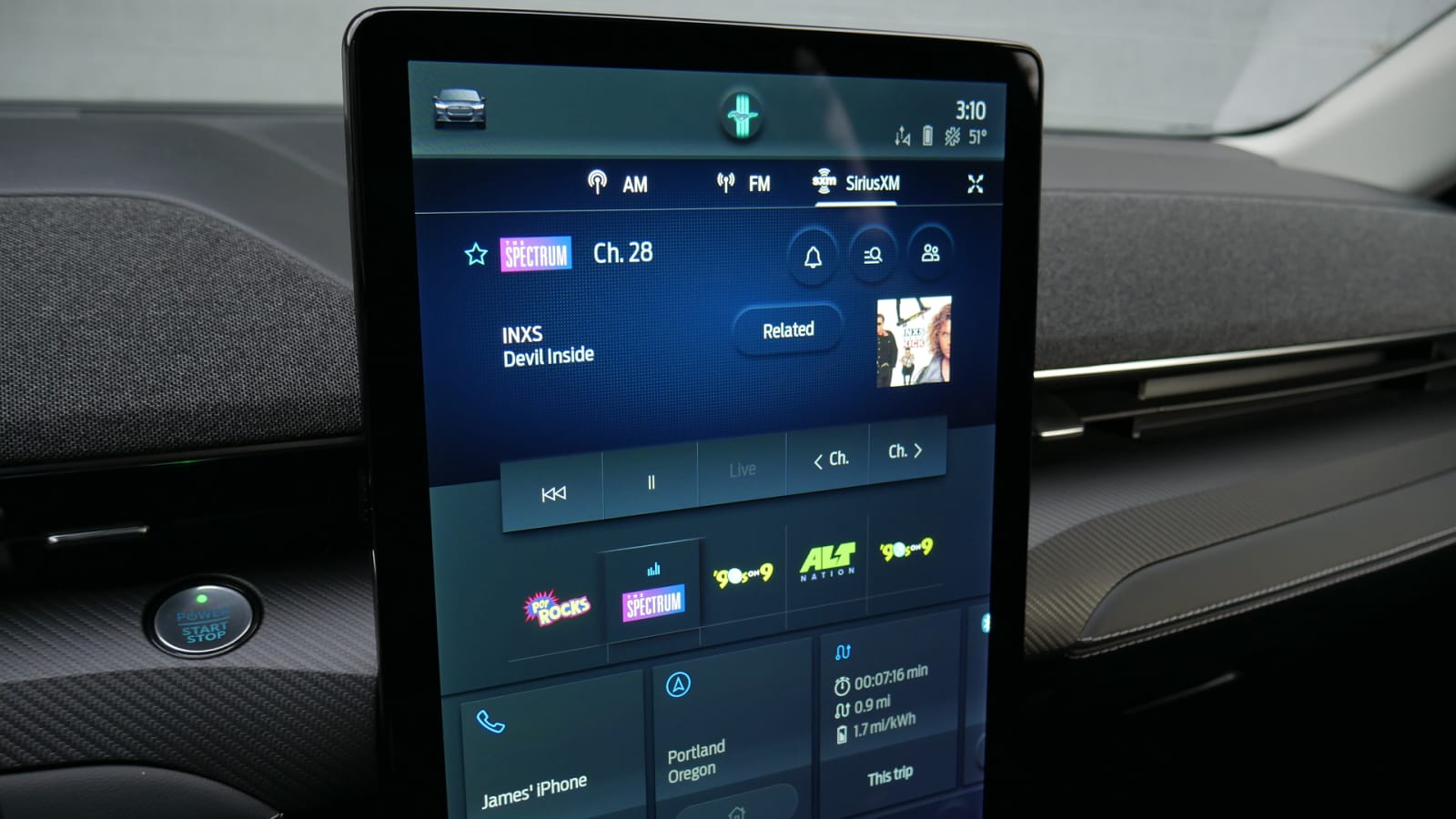
Yet, the car that seems most likely to challenge Tesla’s dominance in both screen size and overall electric car desirability, the excellent 2021 Ford Mustang Mach-E, has the largest of them all. Measuring 15.5 inches, it actually nips the Model Y and Model 3‘s touchscreen by a half inch. One suspects that wasn’t by accident. Unlike the Teslas’ screen, the Mach-E’s is vertically oriented and doesn’t have to pull double duty as an instrument panel since it includes a separate 10.5-inch letterbox widescreen display forward of the steering wheel. You know, where instruments should be.
Let’s take a closer look at the Mach-E’s jumbo screen, but in short, it actually improves functionality over Ford’s smaller infotainment touchscreens. The same can’t be said of other enlarged screens, including those in Ford’s own Explorer and F-150.
Having a giant screen is one thing, but that could just mean automakers will try and stuff as much onto the screen. You end up with information overload and eyes hunting on the screen … and therefore not on the road. You can also have small icons that are the same color as their background, such as Mercedes MBUX, which leaves you with the same distraction problem.
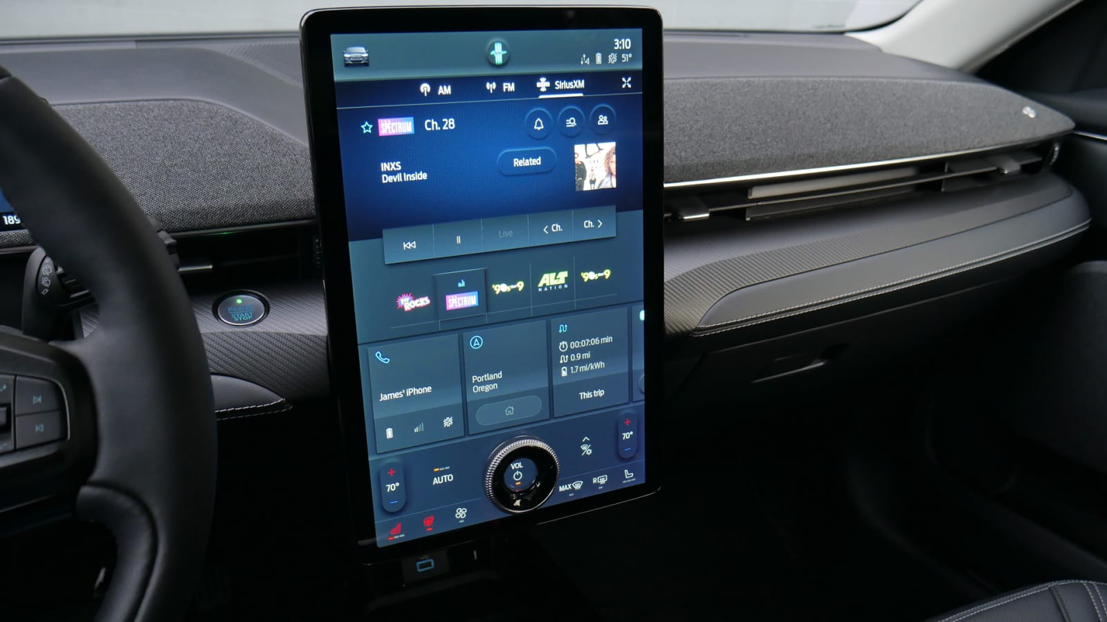
Now, let’s look at the Mach-E. The buttons are huge. They are clearly outlined and there is color variation. Much like the Ram 1500, satellite radio stations are presented by each station’s colorful, easily read logos. They are prominently placed within easy sight and reach. If anything, those icons could actually shrink a bit to fit one or two more and still be larger and more legible than those found in most other infotainment systems.
Although this runs Ford’s latest Sync 4 software, same as the new F-150 and others, the UI is unique to this screen and the Mach-E. It’s officially dubbed Sync 4A. I have and will mostly focus on its functionality, but in terms of responses and speed, I had no complaints. I’m also not a stickler for such things. I’ve never had an issue with Toyota’s systems, for example, and everyone always says they’re glacial.
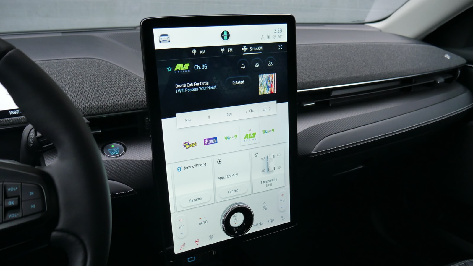
Now, I did not use Apple CarPlay in the Mach-E because like other Fords, I do not like how many functions are locked out during its use (such as the car’s native navigation system or your full Playlist selection). Nevertheless, when you do use CarPlay, only the upper part is taken over — the various other menu tiles, climate controls and top-of-screen menu buttons remain. This is in contrast to so many interfaces where CarPlay takes over the full screen, often requiring multiple touchscreen presses to get back to the car’s native system (as in most other Fords, which is another beef I have with the marriage).
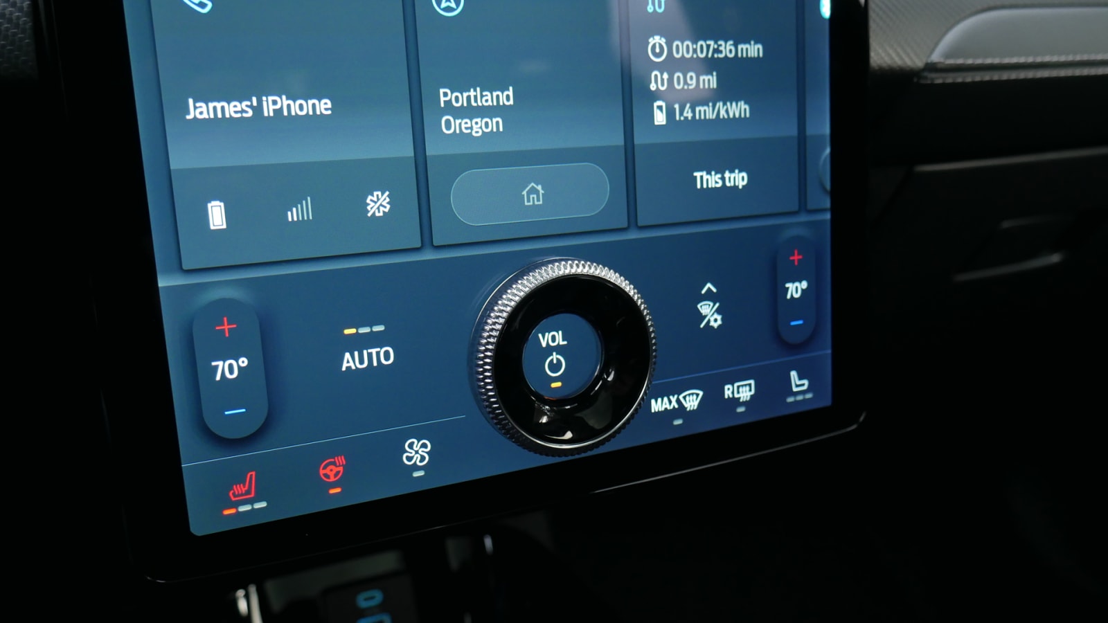
Someone at Ford clearly hates tapping a virtual volume control as much as the rest of us, because the Mach-E has this physical wheel embedded on the screen.
There was apparently not a similar aversion to tapping for temperature changes, but that’s also more tolerable. In general, these touchscreen-based climate controls work fine, but there’s an exception: the recirculation is buried in a sub-menu. There are only two icons on the bottom-right side; there seems to have been room. As it is, you have to expand that sub menu should some stinky diesel thing appear ahead or you suddenly find yourself on I-5 through California’s Central Valley. #cows
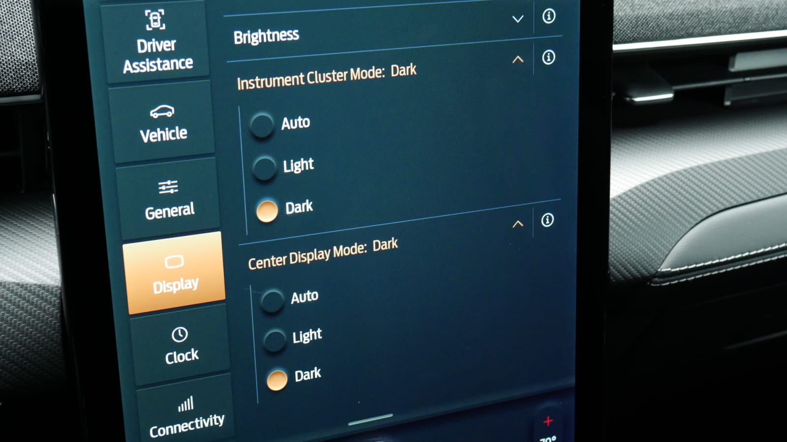
To this point, you have been seeing the screen in Dark mode. That’s how the car was set when I received the car and that’s the way it stayed until I discovered there was a “Light” option.
Hold on, give me a minute for this searing white splotch to wear off from my eyesight.
Holy crap is this thing bright. And worse, as has been previously stated, the screen is gigantic. Admittedly, it wasn’t a sunny day when I took this picture, but it wasn’t dark, either.
This is too much light being shone at a driver who should be focusing on the road ahead. Seriously, who thought having a 15.5-inch light panel aimed at the driver was a good idea? Did they anticipate the driver needing to do interviews on CNN while driving?
I also think it’s much harder to read. Remember when I was talking about the important of contrasting colors? Not so much with Light mode. The fonts are suddenly too small and light in color.
The instrument panel screen also changes between Light and Dark mode.
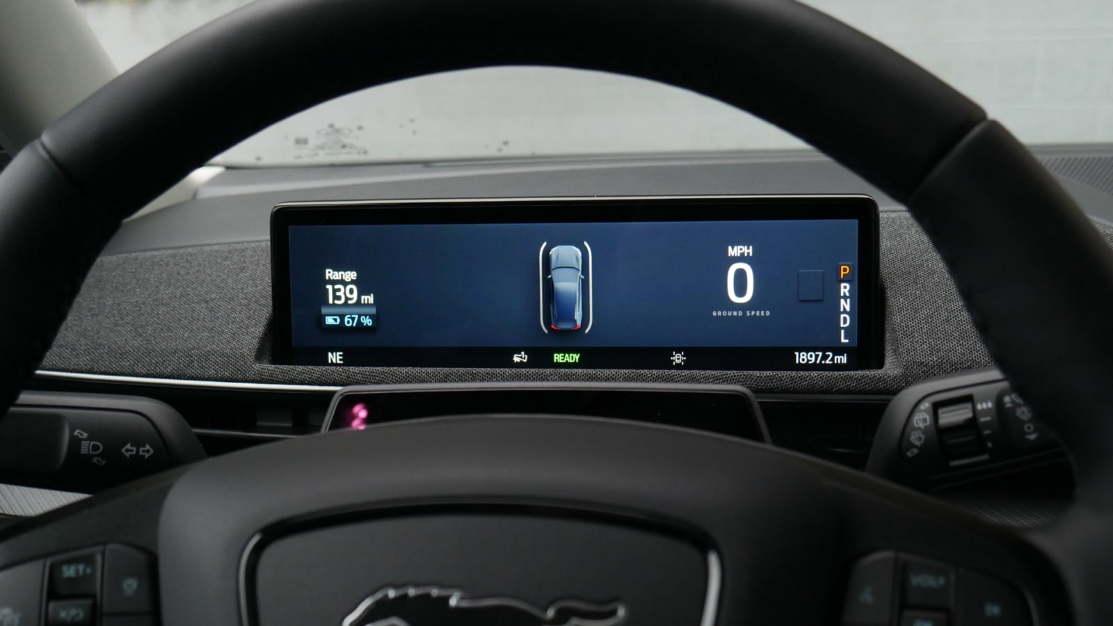
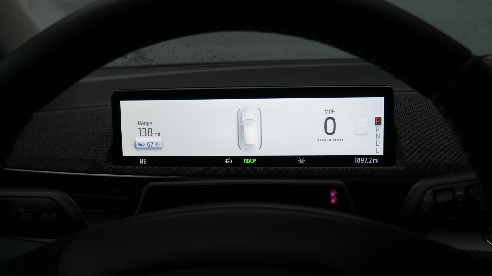
Once again, Dark mode is so much more legible than Light mode, even during the day. (Note that I had to change the camera setting to make the Light screen look as it did to my eyes.)
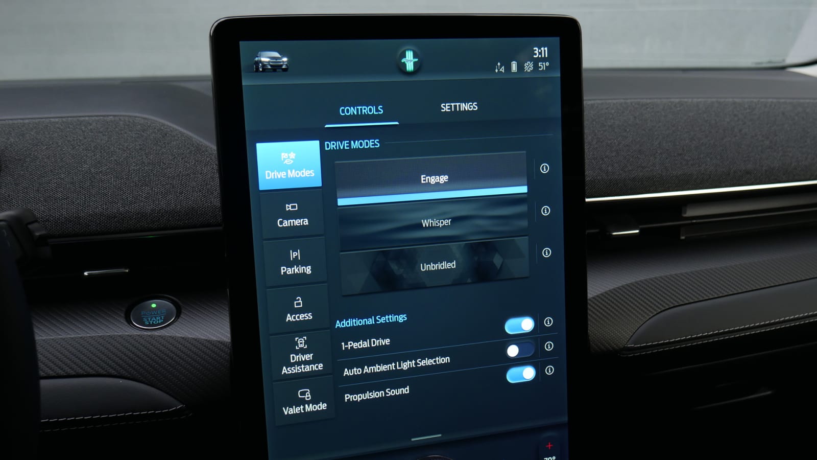
That said, it would be nice if there was some way to alter the layout of this screen. Besides Light and Dark modes, selecting the Mach-E’s “Unbridled” sport mode adds some little amber lines in the upper corners, but that’s it. You can’t move the speedometer into the center or remove the driver assistance icon, for instance, never mind change the entire design aesthetic as you can with Mercedes MBUX and many others. Heck, even the regular Mustang lets you change the colors of its gauges. This really seems like a missed opportunity.
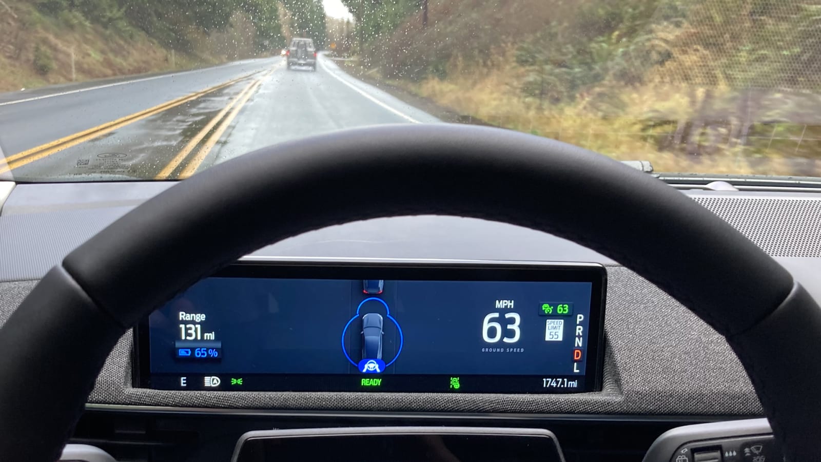
You can see here how the driver assistance icon changes when you have the adaptive cruise control with steering assistance engaged. It basically shows the car extending its shields. Or the silhouette of BB-8.
Here’s a menu for various vehicle systems. This is usually some granular, small-font menu that many automakers black out while moving. In the Mach-E these buttons are, again, huge.
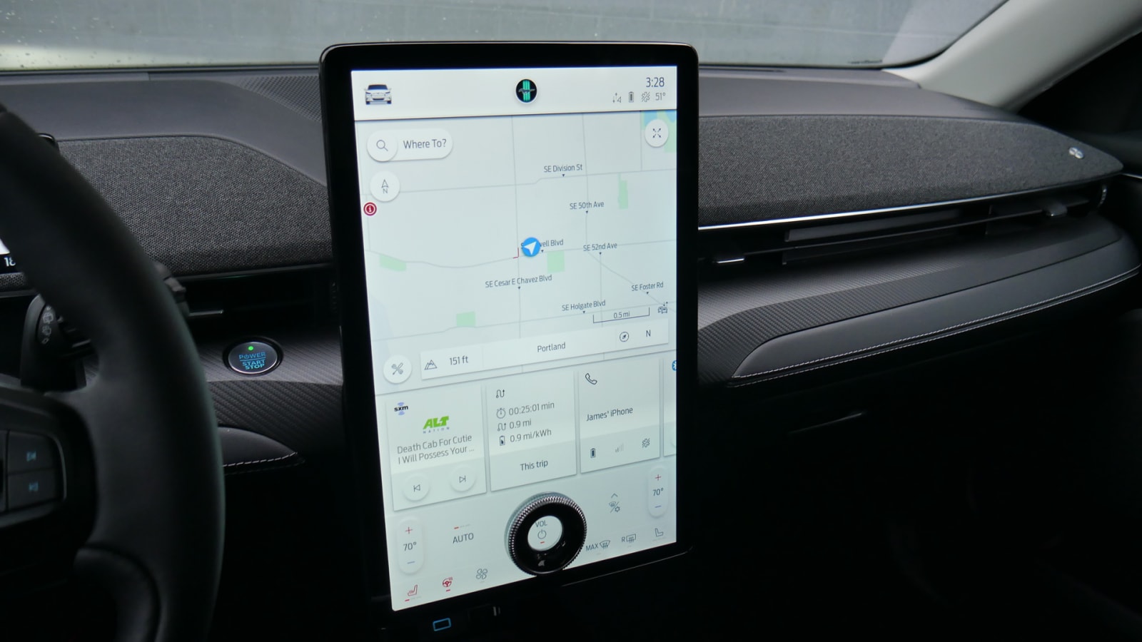
So yes, the screen is big, which can be distracting, but its size, design and layout means your eyes can find what they need quickly, resulting in less time spent on the screen.
![]()
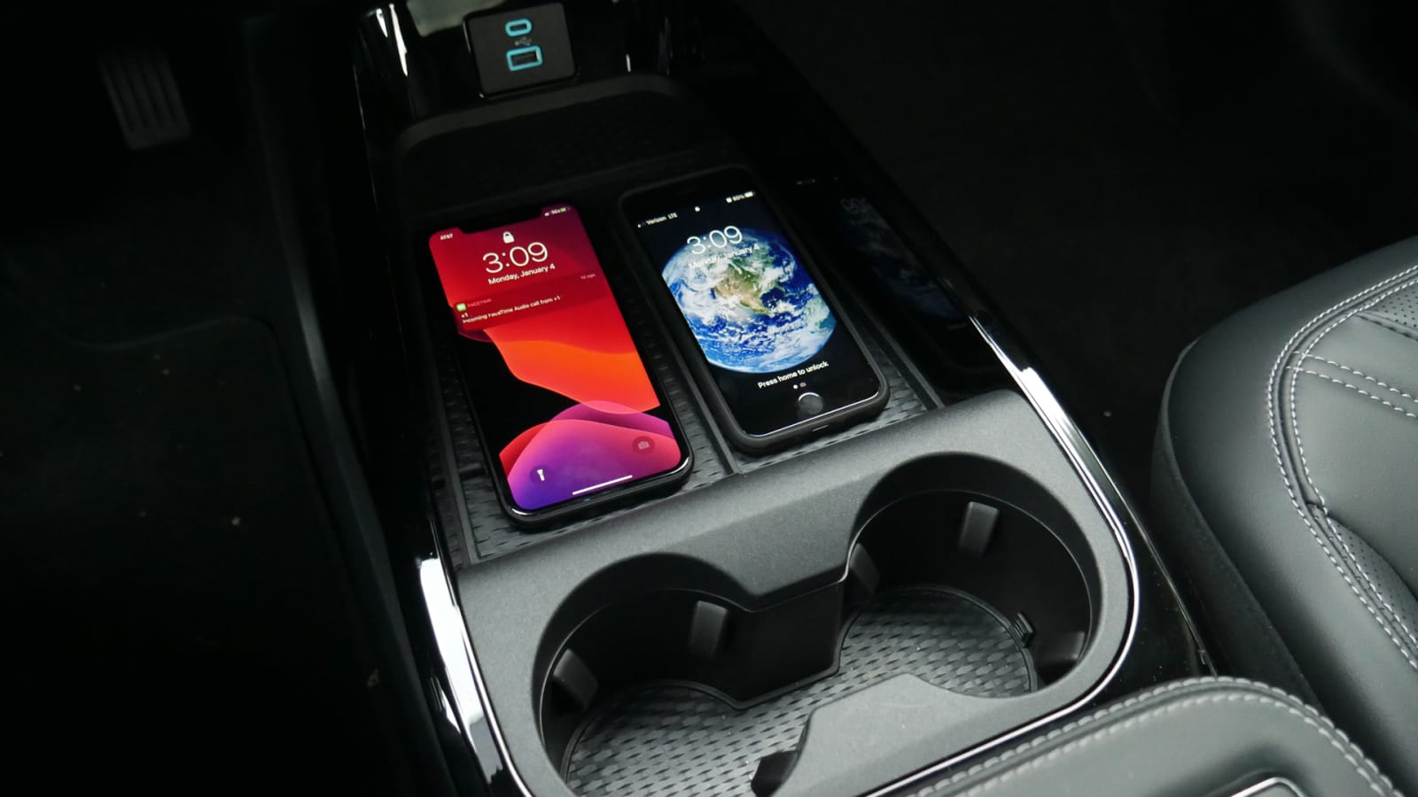
Moving away from screens, the Mach-E has a USB-A and USB-C port, plus a wireless charging pad up front. There’s also a second, charge-free pad next door for a second phone. Both are grippy and have walls on either side to prevent them from flying across the car. There’s another pair of USB ports in the rear.
The Mach-E also includes a 4G Wi-Fi hotspot, lets you use your phone as a key and utilizes the FordPass App to help you monitor charging, find chargers and easily pay for those chargers once found. If there’s a nitpick, I couldn’t figure out a way to send a charger’s address from the app to the car’s native navigation system. If it’s not possible, it sure should be. The app gives you the option of opening the directions in Waze, but why can’t I use the ginormous navigation screen built into the car? Again, maybe there’s a way, but I couldn’t find it.
And indeed, I’m certain I only scratched the surface of what the Mach-E’s Sync4A system can do. I really only stuck to the basics, and refreshingly, it does the basics really well. This layout and design are so good Ford should consider applying it to other vehicles like the Explorer, even if its vertically oriented screen isn’t Tesla-beating big.